
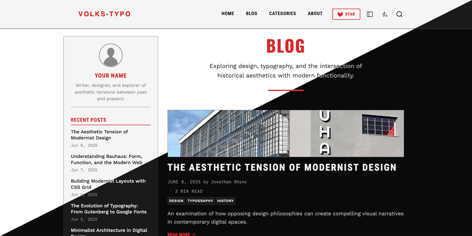
A Zola port of the Astro Volks-Typo theme: a blog theme with bold, industrial typography built on an 8-point grid. It pairs a sidebar layout with a monumental red accent rule, dark-mode support, client-side search, table of contents on posts, and full taxonomy (categories + tags) support.

Minimum Zola version: 0.23.0 (developed and tested on Zola 0.23.3). For Zola versions < 0.23 use release v1.2.1 of this theme.
Landing page

Sidebar left

Sidebar right

The easiest way to install this theme is to clone this repository in the themes directory:
git clone https://gitlab.com/tisgoud/zola-volks-typo-theme.git themes/volks-typoor use it as a submodule:
git submodule add https://gitlab.com/tisgoud/zola-volks-typo-theme.git themes/volks-typoSet volks-typo as your theme in config.toml:
theme = "volks-typo"The theme relies on several built-in Zola features and a set of [extra] keys. A minimal working config.toml:
base_url = "https://example.com"
title = "volks-typo"   # site title — used in <title>, header alt, RSS channel
description = "A blog exploring the intersection of design, typography, and history"
compile_sass = true
build_search_index = true
theme = "volks-typo"
# Site-wide feed off; the blog section emits a blog-only feed at /blog/rss.xml.
generate_feeds = false
feed_filenames = ["rss.xml"]

# Optionally set "paginate_by = 10" to set the number of items per page
# name = "categories", feed = true, paginate_by = 10
# name = "tags", feed = true, paginate_by = 10
taxonomies = [
  { name = "categories", feed = true },
  { name = "tags", feed = true },
]

[markdown.highlighting]
# Zola bundles "nord" (a dark theme close to the original's catppuccin-mocha).
theme = "nord"

[extra]
# Navigation — add / remove / reorder without touching theme files
main_menu = [
  { name = "Home", url = "/" },
  { name = "Blog", url = "/blog" },
  { name = "Categories", url = "/categories" },
  { name = "About", url = "/about" },
]

# Favicon path (in `static/`). Defaults to the bundled `favicon.svg`
favicon = "favicon.png"

Header logo image path (in `static/`)
logo = "site-title.svg"

# Repo URL for the header repository button. Omit to hide the button
repo_url = false
# Repo label default is "Star"
repo_label = "Star"
# Bundled icon name (`github`, `gitlab`, `codeberg`) default `gitlab`
repo_icon = "gitlab"

author_name = "Your Name"
author_bio = "Writer, designer, and explorer of aesthetic tensions between past and present."
# author_avatar = "/images/avatar.jpg"   # optional

# Social links (footer, About author bio, Contact). `icon` is a bundled icon in
# static/icons/ (github, gitlab, codeberg, x, instagram, linkedin, mastodon,
# email) or a custom path like "/icons/gitea.svg".
social_links = [
  { name = "Gitlab", icon = "gitlab", url = "https://gitlab.com/you/your-site/" },
  { name = "Mastodon", icon = "mastodon", url = "https://fosstodon.org/@you" },
  { name = "Email",    icon = "email",    url = "mailto:you@example.com" },
]
[extra] keys read by the themeSite title and description come from the top-level title / description keys
(used by <title>, header logo alt, meta description, and the RSS channel).
| Key | Required | Purpose |
|---|---|---|
main_menu | yes | Header/mobile navigation links ({ name, url }); edit to change the nav |
sidebar_position | no | left (default) or right. A header button also lets visitors show/hide the sidebar (remembered per browser; disabled on pages without a sidebar) |
list_images | no | Show each post's [extra].image as a cropped thumbnail above the title in post listings (blog, categories, tags). Default true |
favicon | no | Favicon path (in static/). Defaults to the bundled favicon.svg |
logo | no | Header logo image path (in static/). Omit to show the site title as text |
repo_url | no | Repo URL for the header repository button. Omit to hide the button |
repo_icon | no | Bundled icon name (github, gitlab, codeberg) or a custom SVG path in static/. Default gitlab |
repo_label | no | Repo button text. Default Star |
author_name | yes | Author shown in sidebar / footer |
author_bio | yes | Short bio in the sidebar |
author_avatar | no | Optional sidebar avatar image path |
social_links | no | Social links ({ name, icon, url }) shown in footer, About, and Contact. icon is a bundled name or a custom SVG path |
Bundled social/forge icons live in static/icons/: github, gitlab,
codeberg, x, instagram, linkedin, mastodon, email. Add your own by dropping an SVG in static/icons/ (or anywhere) and referencing it by path.
Any omitted social key simply hides that link.
Copy the files from themes/volks-typo/content and themes/volks-typo/static to your content- and static directory.
content/
├── _index.md                 # home page
├── about.md                  # template = "about.html"
├── contact.md                # template = "contact.html"
├── search/
│   └── _index.md             # search index data (required for search)
└── blog/
    ├── _index.md             # blog list section
    ├── <post>.md             # a simple post
    └── <post>/               # a post with colocated images (page bundle)
        ├── index.md
└── photo.jpgcontent/blog/_index.md+++
title = "Blog"
sort_by = "date"
paginate_by = 5
template = "blog.html"
page_template = "page.html"
++++++ TOML)+++
title = "Understanding Bauhaus"
date = 2024-01-15
description = "A short summary used for meta and feed."
[taxonomies]
categories = ["Design"]
tags = ["bauhaus", "history"]
[extra]
excerpt = "Optional excerpt shown in listings and the RSS feed."
author = "Your Name" # optional, falls back to author_name
image = "/img/post.jpg" # optional; path to a file in static/.
# Shown as a hero image on the post
# and used for OpenGraph/Twitter
# social-share previews.
+++image shortcodeThe theme ships one shortcode, image, that resizes images at build time
(wrapping Zola's built-in resize_image()), so posts serve appropriately-sized
files instead of full-resolution originals.
It accepts the same sizing options as resize_image(): width, height
(pixels), op (fit_width, fit_height, fit, scale, fill; default
fit_width) and format (default auto). Numbers go in {…}, strings stay
quoted, and the tag is self-closing (/>).
The path tells the shortcode where to look — like a URL:
Leading / → an external asset, resolved the way resize_image()
always resolves: /, /static, /content, /public. No page needed.
{{/*< image path="/img/photo.jpg" width={800} op="fit_width" alt="A description" />*/}}No leading / → a local (colocated) asset, sitting next to the post's
index.md. You must pass page — Tera components can't see the current page
unless it is handed to them, and resize_image() does not search bundle
folders on its own.
{{/*< image path="photo.jpg" page width={800} op="fit_width" alt="A description" />*/}}Captions. Add a caption and the image is wrapped in a <figure> /
<figcaption> instead of a bare <img> (use figure={true} for a caption-less
figure):
{{/*< image path="photo.jpg" page width={800} caption="A caption." alt="A description" />*/}}Alignment. align — left, center, or right. The default depends on the
form: a plain image defaults to left (like a raw markdown image), a figure
(with a caption) defaults to center. An unrecognised value stops the build with
a message listing the valid options.
{{/*< image path="photo.jpg" page width={400} align="center" alt="…" />*/}}Local images need a page bundle: make the post a folder with an
index.mdand put the images beside it — e.g.content/blog/my-post/index.mdpluscontent/blog/my-post/photo.jpg. The bundledworking-with-imagespost is a working example.If you use a local path (no leading
/) but forgetpage, the build stops with a message telling you exactly how to fix the call — either addpage, or use a leading/for an image instatic/.
before_after shortcodeA before/after image comparison slider (CSS + a little JavaScript): the before
image is on the left, the after on the right, and you drag the round handle to
reveal one over the other. Both images are generated at the same size so they line
up. Paths follow the same convention as image (leading / for a static asset; a
bare name plus page for a colocated one).
{{/*< before_after before="old.jpg" after="new.jpg" page label_before="Old" label_after="New" />*/}}
{{/*< before_after before="/img/old.jpg" after="/img/new.jpg" ratio="16/9" width={500} />*/}}| Option | Meaning |
|---|---|
before / after | the two images (required) |
page | pass it for colocated images (bare-name paths) |
width | display width in px (default 800); the slider renders at min(100%, width). Images render at 2× for sharpness — there is no separate resolution knob |
ratio | aspect ratio as "W/H" or "W:H" (e.g. "16/9"). Crops both images to it. Omit to keep the before image's own proportions (no cropping) |
start | opening split, 0–100 (% from the left). Default 50 |
label_before / label_after | text shown over each image. Default none |
alt_before / alt_after | alt text for each image |
Styles ship in main.css (from sass/_before-after.scss) and the behaviour in
static/js/before_after.js, which the shortcode loads on demand. The handle and
divider use the theme's accent colour. The bundled working-with-images post has
live examples.
before_current_after shortcodeFor three stages, before_current_after stacks three images with two handles,
revealing them left→right as before | current | after. It shares the look and
options of before_after, adding the middle image. The before handle can never
pass the current handle, and the two handles keep a small gap so they never stack.
{{/*< before_current_after before="a.jpg" current="b.jpg" after="c.jpg" page
label_before="2019" label_current="2022" label_after="2026" />*/}}| Option | Meaning |
|---|---|
before / current / after | the three images (required) |
page | pass it for colocated images (bare-name paths) |
start | before handle position, 0–100 (% from the left). Default 33 |
start_current | current handle position — the second slider. Default 66. Clamped to be ≥ start |
width | display width in px (default 800); as for before_after |
ratio | aspect ratio "W/H"; crops all three images. Omit for the before image's own shape |
label_before / label_current / label_after | text over each region |
alt_before / alt_current / alt_after | alt text per image |
Styles ship in sass/_before-current-after.scss (into main.css) and behaviour in
static/js/before_current_after.js.
Edit the page text directly in the markdown body — the templates render
page.content, so no template override is needed. The About page also shows the
author bio + social links (from [extra]), and Contact shows the social links;
those come from config, the prose comes from the markdown.
+++
title = "About"
template = "about.html"   # or "contact.html"
+++

## About This Blog

Your prose here. Headings, lists, **bold**, links — all standard markdown.content/search/_index.mdRequired so the search overlay has data to query:
+++
title = "Search"
template = "search_json.html"
+++This is a faithful structural port. A few intentional differences:
nord theme. The original's
catppuccin-mocha is not bundled with Zola; both are dark themes, so the visual
match is close.mdx-test
sample page were dropped.build_search_index = true enabled.LICENSE).static/fonts/) — Oswald, Work Sans, JetBrains Mono
(SIL Open Font License 1.1); Roboto Condensed
(Apache License 2.0). Self-hosted woff2 subsets.static/icons/) — brand/forge marks from
Simple Icons (CC0 1.0). The email icon and the
theme-toggle sun/moon/bolt icons are original.